|
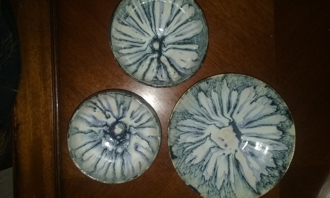
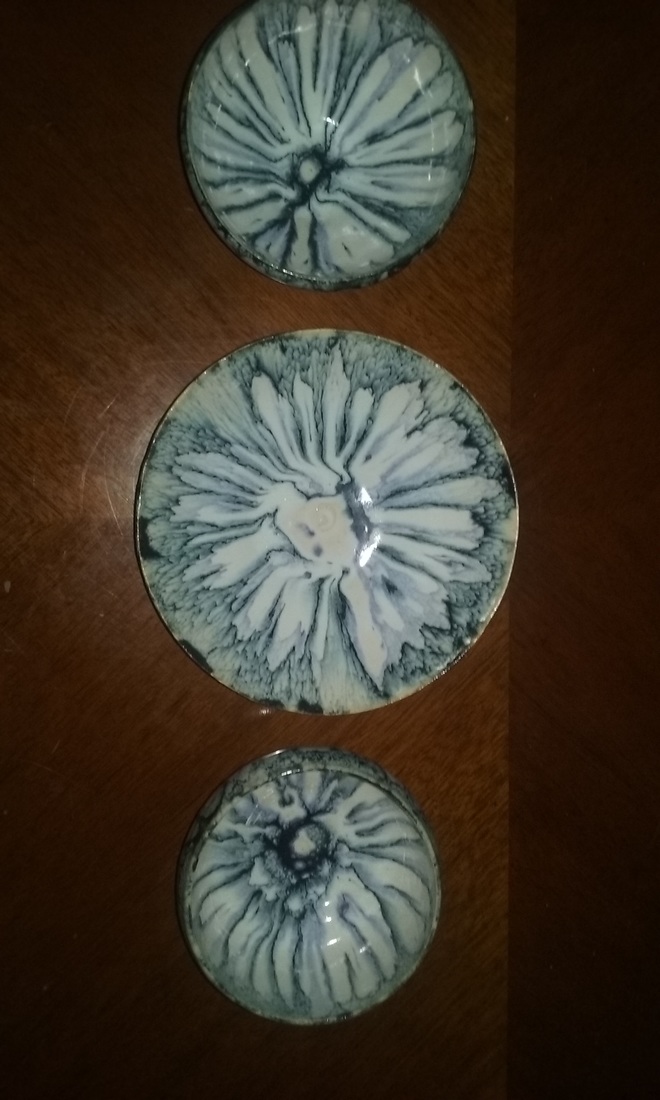
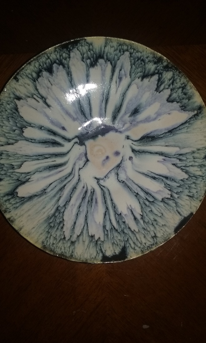
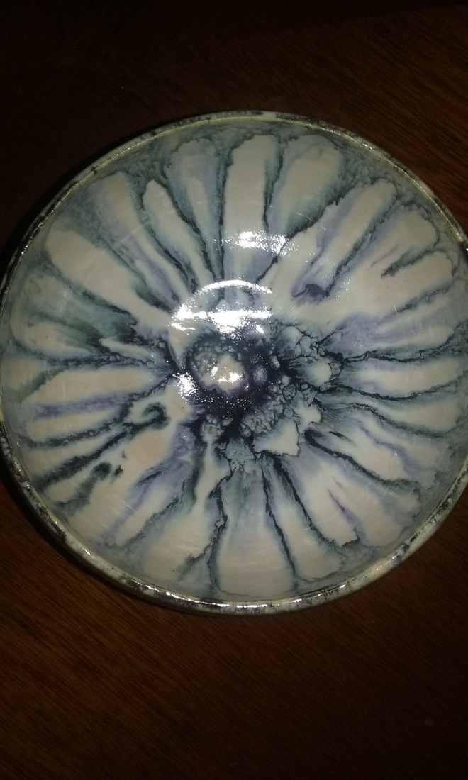
These are my set of three, they are by far my best work yet! Within there are two bowls, a small and a medium, as well as a platter. The bowls were thrown one day and the platter the day after. I bisqued them seperately but waited to glaze them all at the same time. I glazed them in a white background, and then used a brush to apply blue glaze the lip, allowing it to run down the sides and to the center organically. The art element is uniformity, the design element is contrast. Mood is contradiction.
0 Comments
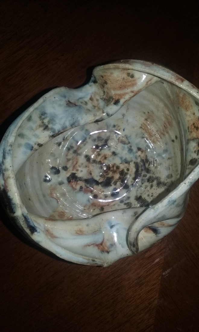
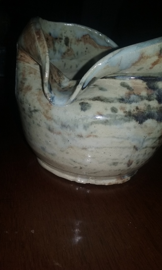
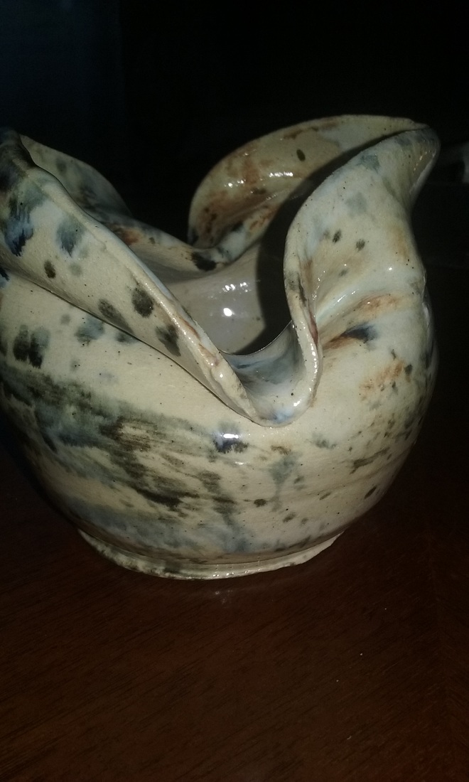
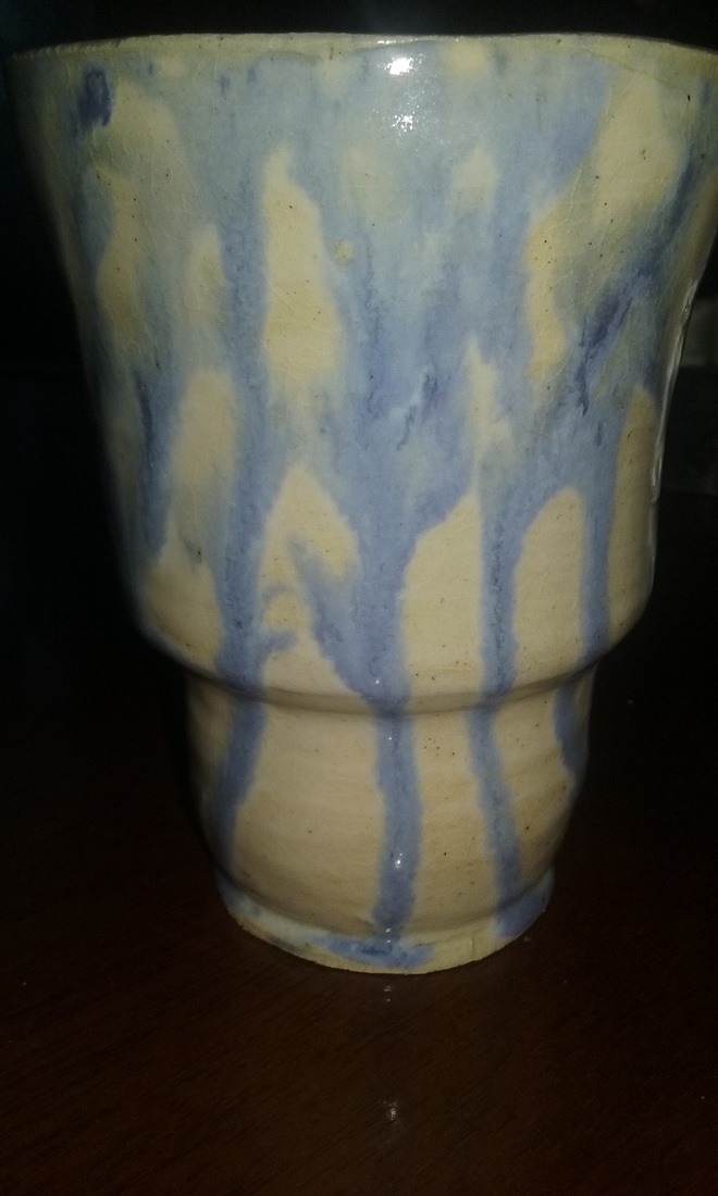
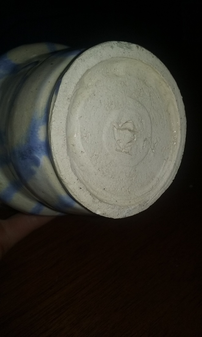
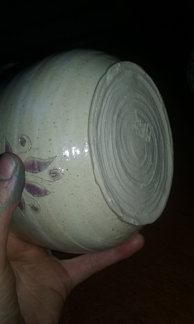
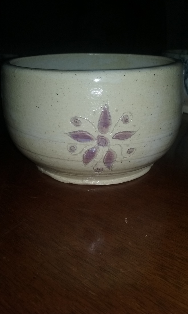
This is my wheel altered project. To make it I created a vase and then pitched down the sides. I glazed it in white and then then splattered on burnt orange, blue, and black. The art element is form, which was altered to create a different application of focus when viewing. The design element is contrast; contrast between the glaze and flow of the project. Mood is intense. This is my tall project, it is 8 in tall and 4 in across. It is a vase currently in use in my house to hold purple tulips. It is glazed in white and a custom blue glaze that i really love. The art element is color, the custom blue creates a contrast to the white glaze used as the base. The design element is contrast which gives the simple glaze value. Mood is playful. This is my second bowl of quarter, it is my fourth bowl to turn in over all. It is a medium sized bowl, glazed in white and stained in purple. While my bowl was relatively wet, I carved small flowers in a few places on the outside and on the bottom. The art element is shape, which was really perfected in this project by using the rib tool to create a perfect form. The design element is texture, created by the flowers and glaze. Mood is gentle. |
AuthorWrite something about yourself. No need to be fancy, just an overview. Archives
June 2016
Categories |


 RSS Feed
