|
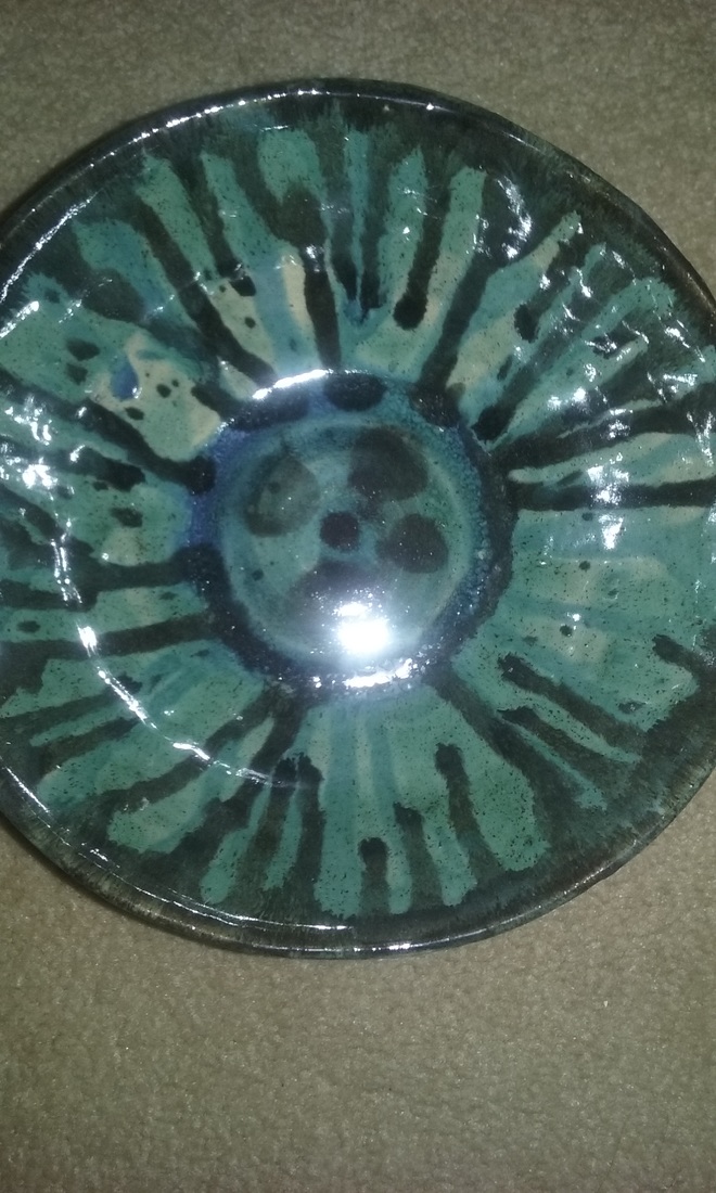
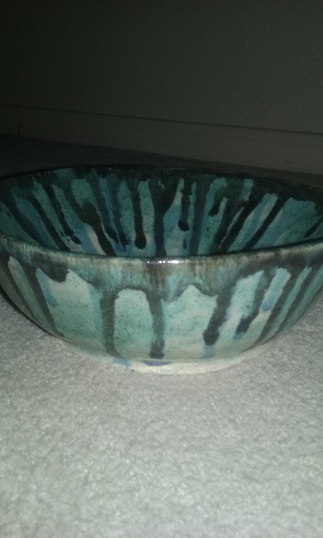
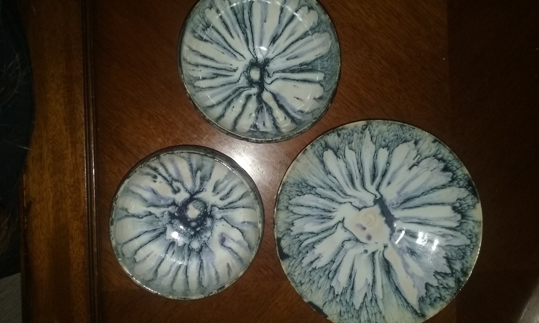
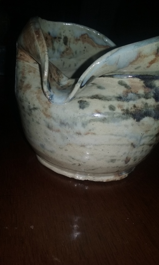
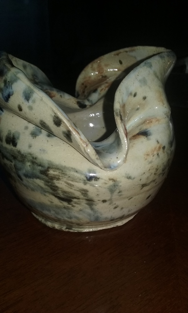
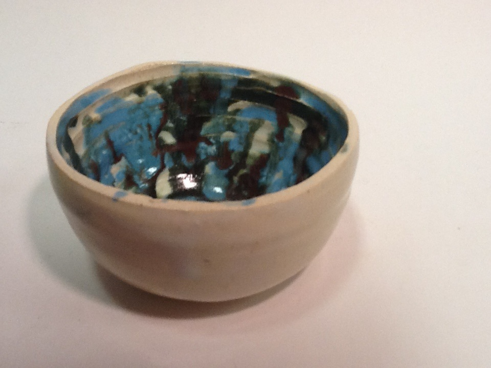
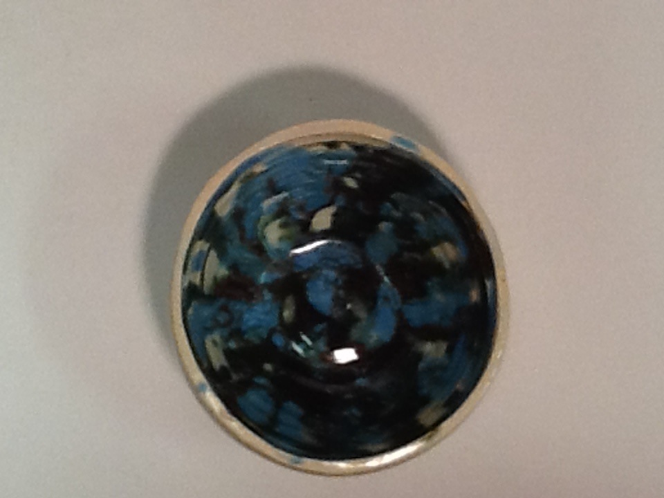
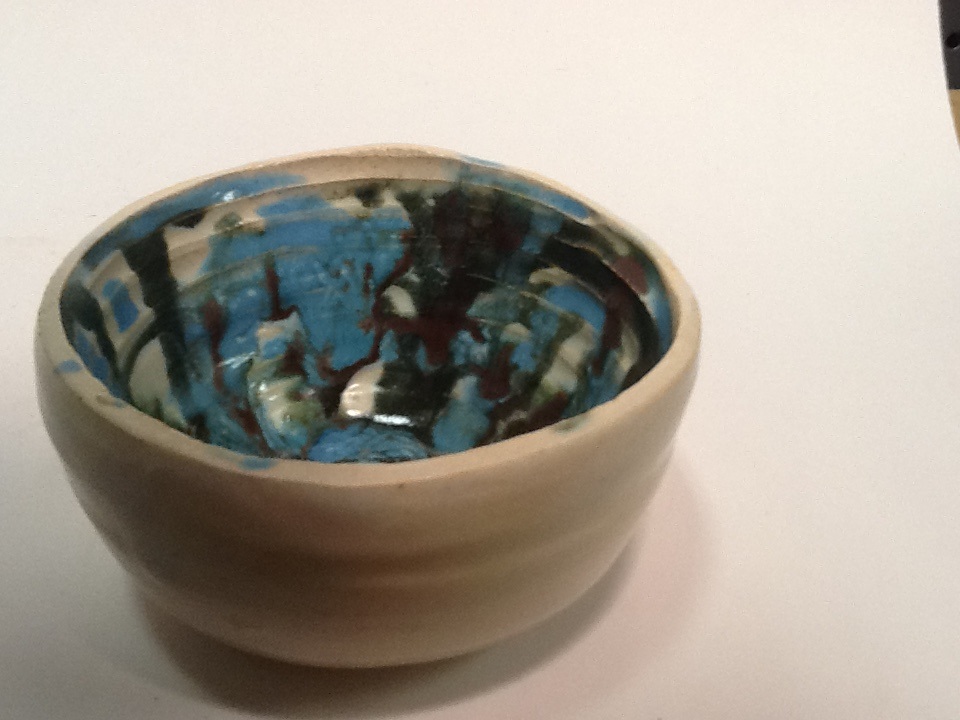
This is my second theme project, it is a simple bowl with a complicated glaze. Its emphasis on the design created by the glaze leads the most attractive qualities of the project. Once again I used my signature drip method to add contrast, however this time instead of using a white background, I used shadow green. I then dripped black and my signature blue to contrast the green used. The art element is form and the design element is contrast. Mood is complicated.
0 Comments
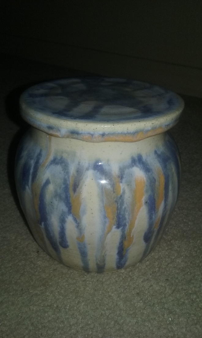
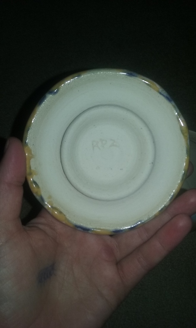
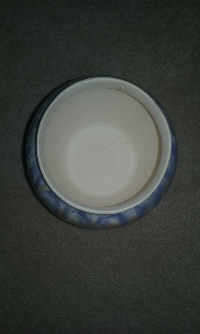
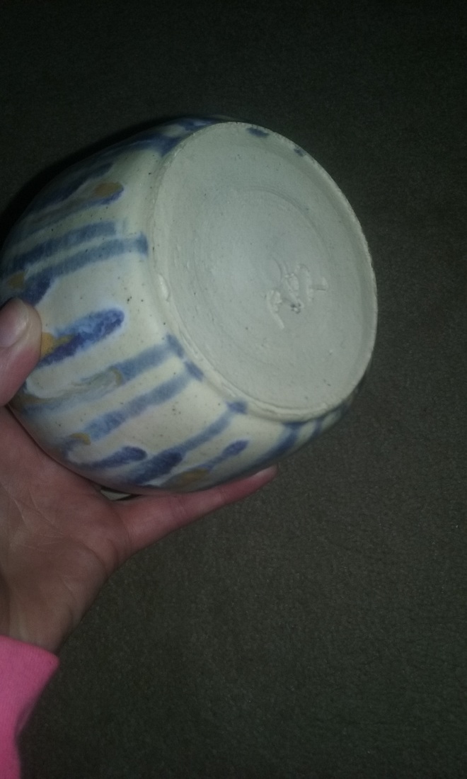
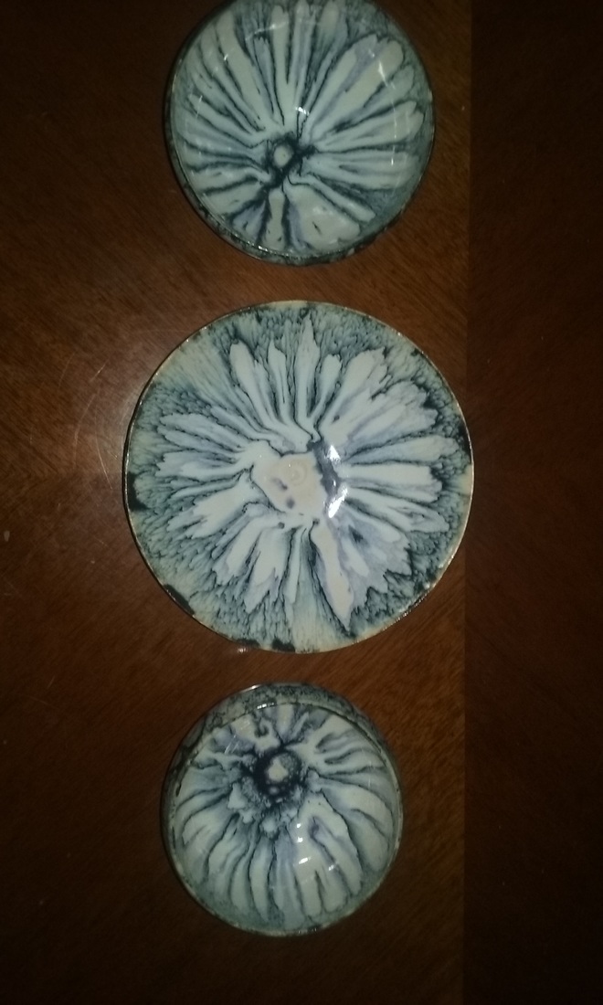
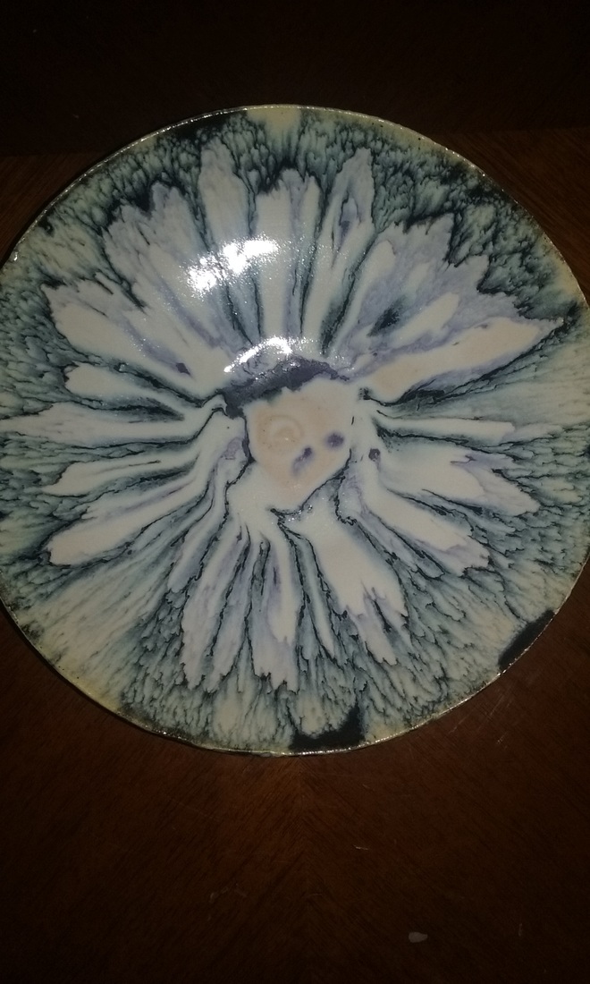
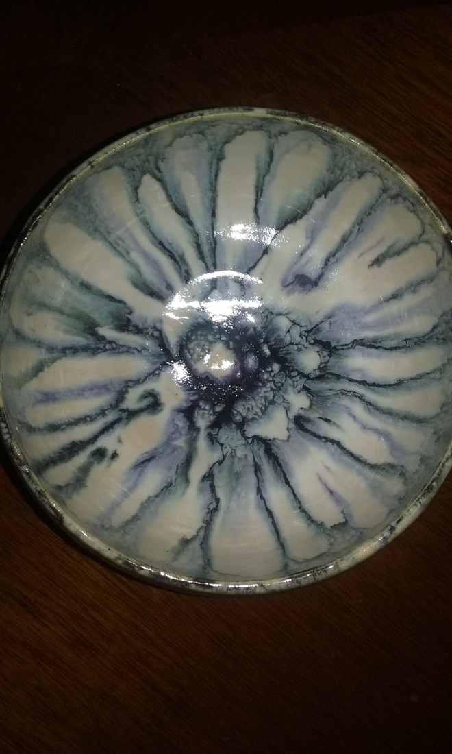
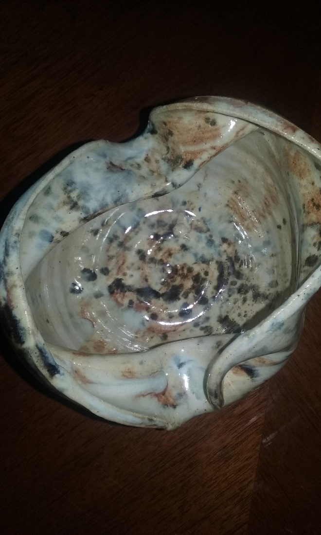
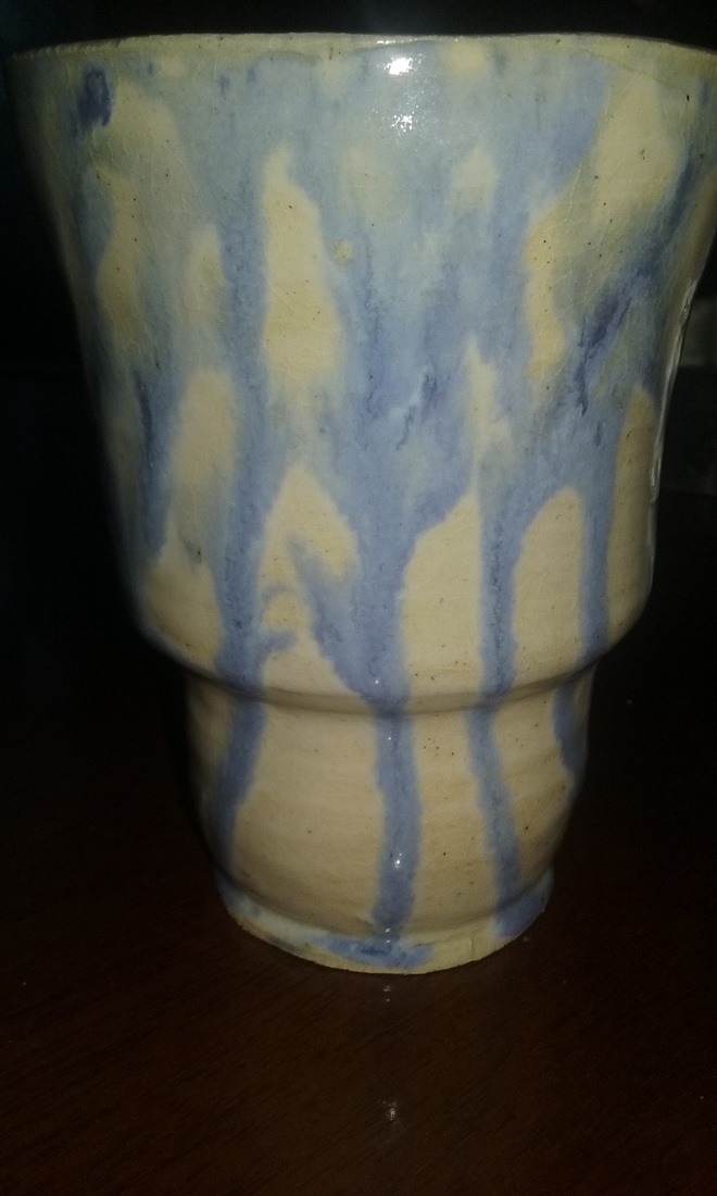
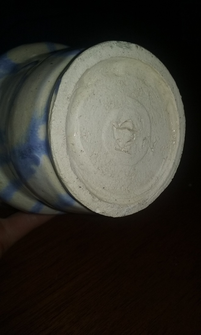
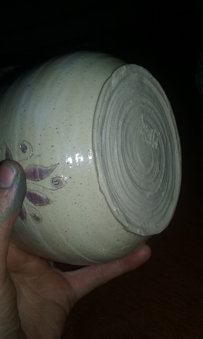
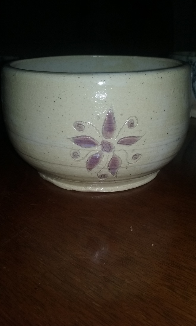
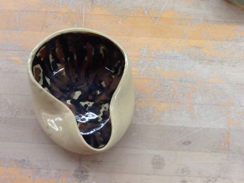
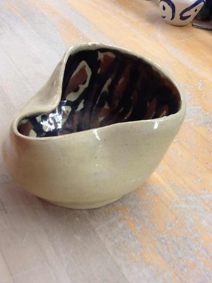
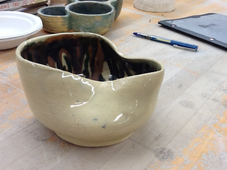
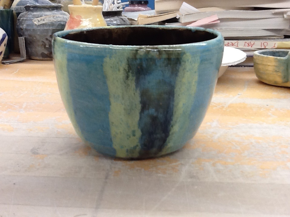
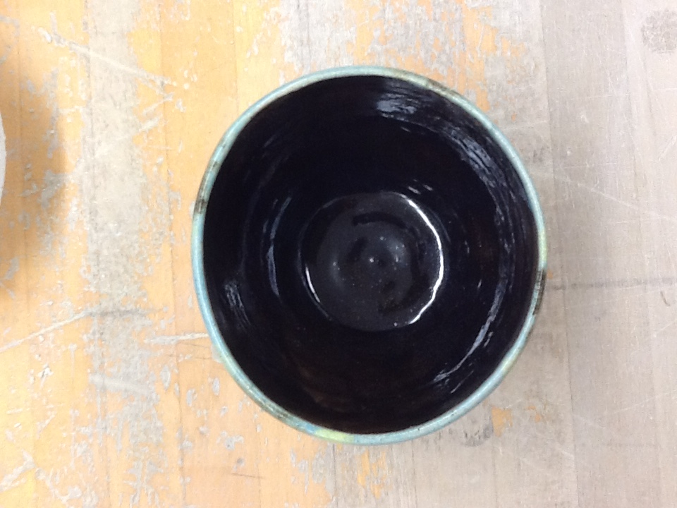
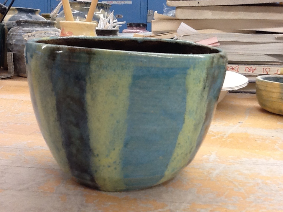
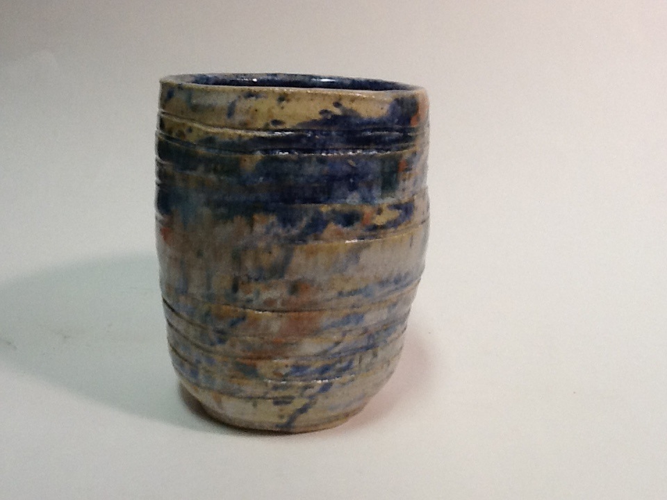
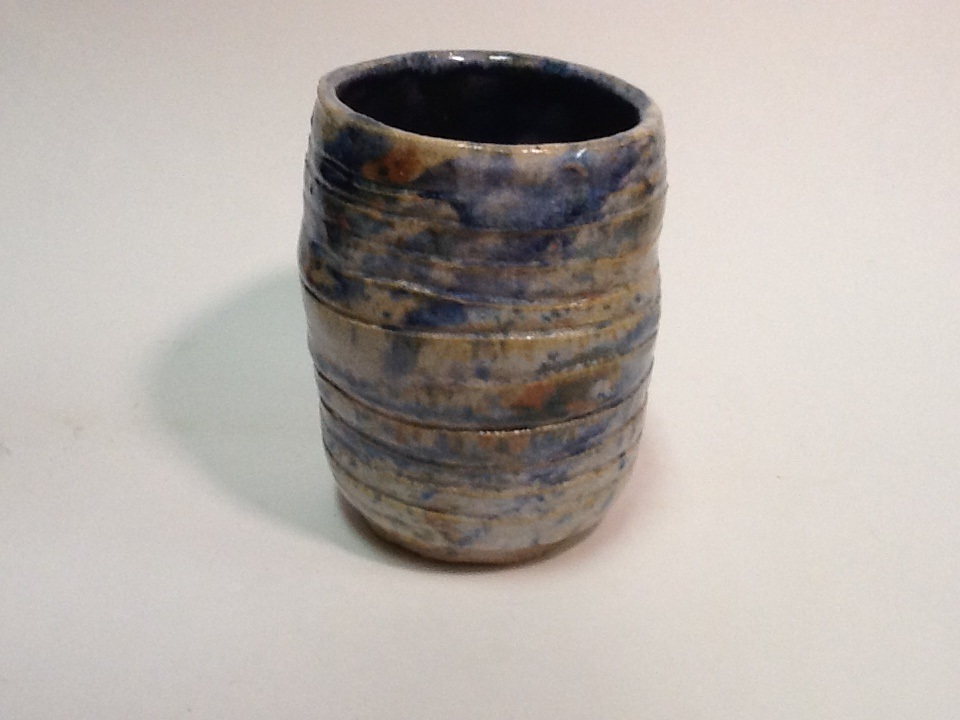
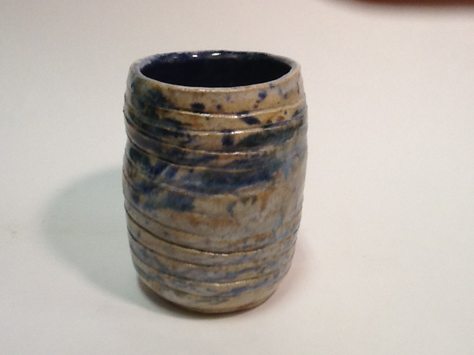
This is my first theme project for the quarter, its a lidded vase. I threw the vase and then created a small plantar (technically) to act as the lid. It is glazed in white as a background and then dripped with my favorite blue glaze that I have been using all year, as well as a golden yellow/tan that has no label. This is my theme project because over the course of the semester I have developed what really works for me as an artist. The glaze is what really pulls the pieces together, the dripping really allows for unique and contrasting projects every time. The art element is form and the design element is contrast. Mood is contained. These are my set of three, they are by far my best work yet! Within there are two bowls, a small and a medium, as well as a platter. The bowls were thrown one day and the platter the day after. I bisqued them seperately but waited to glaze them all at the same time. I glazed them in a white background, and then used a brush to apply blue glaze the lip, allowing it to run down the sides and to the center organically. The art element is uniformity, the design element is contrast. Mood is contradiction. This is my wheel altered project. To make it I created a vase and then pitched down the sides. I glazed it in white and then then splattered on burnt orange, blue, and black. The art element is form, which was altered to create a different application of focus when viewing. The design element is contrast; contrast between the glaze and flow of the project. Mood is intense. This is my tall project, it is 8 in tall and 4 in across. It is a vase currently in use in my house to hold purple tulips. It is glazed in white and a custom blue glaze that i really love. The art element is color, the custom blue creates a contrast to the white glaze used as the base. The design element is contrast which gives the simple glaze value. Mood is playful. This is my second bowl of quarter, it is my fourth bowl to turn in over all. It is a medium sized bowl, glazed in white and stained in purple. While my bowl was relatively wet, I carved small flowers in a few places on the outside and on the bottom. The art element is shape, which was really perfected in this project by using the rib tool to create a perfect form. The design element is texture, created by the flowers and glaze. Mood is gentle. This is an extra credit bowl I made for soup and cereal. The sides of the bowl are bent to fit a hand grip. I have tried this out and it is the best ever! Love it! This is my Bowl 3 for 2nd Quarter! Wahoo all my projects are caught up!! It is 6 inches tall and 4 1/2 inches in diameter, the base is 3 inches. It is glazed in turquoise, black and yellow. I glazed it blue first, then painted on thick yellow stripes and surrounded the yellow stripes with black ones. The inside is glazed in black. The art element in this project is uniformity and the design element is simplicity. Mood is minimalist. This is our team frankenpot. It was so much fun to make this and suer cool to see the end results of all our work. I made the base, Mckenna made the middle portion and Holland made the top. The first day I made the base, and helped Mckenna make her portion. It was really clear that she needed a lot of guidance and help, so it was positive that this was a group project for her. We put both pieces in a bag to dry out. The next day I helped Holland to make her portion, and she also needed a ton of help with this as well. She had not been on the wheel yet so I coached her through the process. We put the piece in a bag and left the rest in the bag as well. The third day I put all the pieces together and put the design on the pot as well. I had to do this because I really didn't trust the girls to do this. We put it in a bag and left it overnight so it wouldn't fall apart. The next day after that, I footed the project and put it in my locker to dry over the weekend. The next Monday we put it on the bisque shelf and it came out on Wednesday. We then glazed it, the inside in indigo blue, outside in white and splattered on more indigo and burnt orange. I did most of the glazing, although the girls helped with input and supplying the glaze for me. It came out on Friday, two weeks after the start. I honestly thought I would hate this project because I usually dislike group projects but I loved this one! This is my choice project for 1st quarter. It is a simple small bowl created on the wheel. It was glazed in Iron Tan over the entire surface: I then proceeded to drip turquoise, green, and brown around the inside lip to create a natural pattern. The art element is color, which gives the project a unique aura. The design elements is contrast, the different colors used inside create a contrast with the simplicit of the glaze outside. Mood is thoughtful. |
AuthorWrite something about yourself. No need to be fancy, just an overview. Archives
June 2016
Categories |


 RSS Feed
